Archive for category Technical Alerts
xUP signals on my radar $OCN $FOSL $ALGT $MGA $CTRX $IEP $CYH
Posted by stubbybrown in Technical Alerts on 2013/06/11
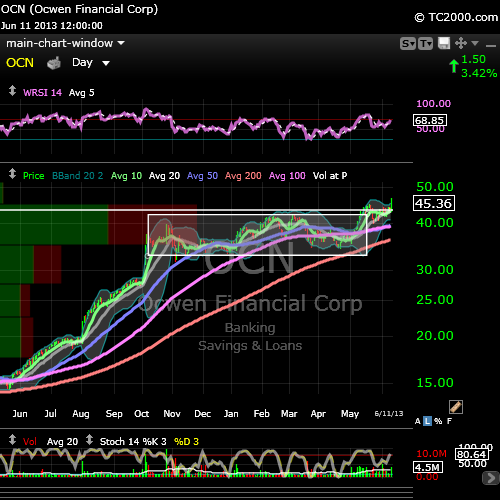
10DMA xUP 20DMA: $OCN
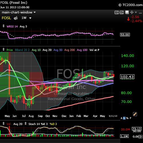
10WMA xUP 20WMA: $FOSL
10WMA xUP: $CTRX $IEP


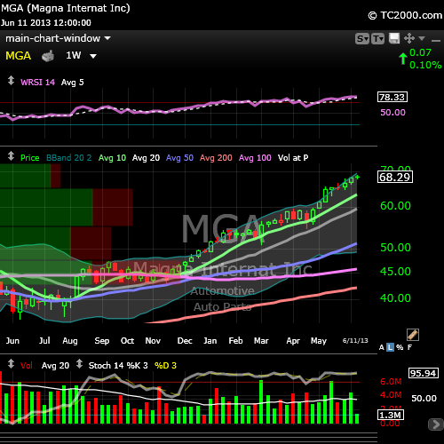
weekly STOC xUP: $ALGT $MGA

weekly MACD xUP: $CYH

18 stubbyselect 10DMA xUPs [EOD20130528] $VRTS $AMG $FLT $PKG $BEAV and more
Posted by stubbybrown in Technical Alerts on 2013/05/28
symbols in alphabetical order: AE AMG AMP BEAV BLK CI DIS DISCK EVR FBHS FLT GEL LVS MANH PKG UHS VRTS WAB
disclosure: stubby is long UHS, WAB
charts: in alphabetical order @ finviz. NOTE: DISCK is not listed at finviz.
stubbyselect criteria:
- price crossing up 10DMA
- short float <5%
- IBD composite rating: 80 or up
- IBD rs rating: 80 or up
- IBD eps rating: 70 or up

stubbystock technical alert: breakouts continue $OCN $JJSF $GMCR $CAB FEIC and more
Posted by stubbybrown in Technical Alerts on 2013/05/16
breaking out: OCN JJSF GMCR VRTS FEIC ULTI ARMH GS WDR CBS
finviz charts: http://bit.ly/106Z0eT
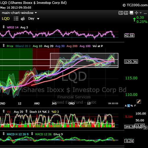
stubby technical alert: $LQD exhibiting head and shoulder
Posted by stubbybrown in Technical Alerts on 2013/05/16
$LQD getting a nice bounce today. but beware of head and shoulders that has emerged in the box drawn below.
stubbystock technical alert summary [EOD20130502] $FEIC $CBS $MDSO $HCA $SNI $TARO and others
Posted by stubbybrown in Technical Alerts on 2013/05/02
- table below is the result of screening my holdings at EOD for the respective bullish technical conditions.

- table below is a histogram of the number of times a stock above populated my screens.
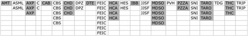
- i use worden TC2000 for the majority of my charting & TA w.r.t. the above. at some point i will post the details of these screens. i’m very picky for the kind of stocks that indicate bullish signals. obviously not all “bulls” are the same and vice-versa with “bears.”
stubbystock technical alert summary [EOD20130429] $VRX $GMCR $SRE $HES and others
Posted by stubbybrown in Technical Alerts on 2013/04/29
NOTE: stubbystocks are equities or etfs i hold as of this post. quotes via StockTwits.com
- RSI xUP 5DMA #bullish #signal $VRX $COO $JBHT $SRE $IFF
- 10DMA xUP 20DMA #bullish #signal $GMCR $CP $IYF $UNF
- STOC xUP #bullish #signal $IYK $SRE $CHD
- MACD xUP #bullish #signal $HES
- daily price xUP 10DMA #bullish #signal $CSGP $VRX $GMCR
EDUCATIONAL RESOURCES:
a short-term bearish equity market outlook $SPX $DIA $QQQ
Posted by stubbybrown in Commentary, Technical Alerts on 2013/04/27
during the remainder of this quarter, equity markets are likely to be under some selling pressure. this thesis is based on the historical pattern of rising and falling US 30yr T-bond yields which influence equity market sentiment changes from risk-on and risk-off. however longer-term, my outlook toward equities is constructive. the charts i’ve included help illustrate my thesis.
CHART #1 – making the case that longer-term uptrend market sentiment in equities is still intact
- LEGEND:
- US 30yr T-bond yield index $TYX–X (candlestick) vs SP500 $SPX (yellow trace)
- $TYX–X bond yield and $SPX price (y-axis) are logarithmic
- timeframe (x-axis): 1997 to present. each candlestick bar represents a quarter year
- overlays: bond yield index quarterly moving averages 10 (green), 20 (grey), 50( blue), 100 (magenta)
- overlays: bollinger band (light blue)
- pre & post quantitative easing by the federal reserve $FED is demarcated by the white vertical line

- COMMENTARY:
- the 2 white circles (w/red arrows over top the blue curve) to the left of the white line (denoting pre-FED QE) indicate the level of the 30 yr bond yield index $TYX–X when 2 market crashes commenced. bond yields move inversely to bond prices. when institutions, investors and traders start buying 30yr T-bonds at an increasing rate, it’s a good indication sentiment has changed and risk is to the downside for equities. when $TYX–X yield index levels approached the 50 quarter moving average (blue curve), a sell-off in equities commenced as investor sentiment got extremely bearish. the first crash is the familiar DOT COM bubble burst and the second crash is when the federal government let LEHMAN BROTHERS investment banking institution fail.
- in oct-2008 the ripple effect of the LEHMAN failure was so systemic & global in scope, essentially all banks national & foreign stopped lending money to each other over night creating a liquidity freeze. it was later coined that banks of LEHMAN’s size were too big to fail and the treasury & federal reserved stepped in to unfreeze lending to restore market confidence. the correlation between the 50 quarter moving average of the 30yr bond index is coincidental and not causal imo.
- in nov-2008, the federal reserve instituted quantitative easing (QE which entails bond purchases by the federal central bank) drove bond prices up and lowered interest rates aided by even other facilities the $FED rolled out. the intent of the $FED was also to make bond prices so expensive, market participants would stop buying bonds for safety and seek greater capital appreciation potential in the equites market and restore confidence in the financial system.
- knowing that the $FED was underneath everyone else buying bonds, equity capital markets eventually re-gained confidence and investors started selling their bonds. as such bond prices dropped and bond yields rose. notice 2 times after QE commenced, yields approached the 50 quarter moving average mark and equities began selling off again. these events were precipitated by different market events. so increased bond buying commenced by the $FED (extending QE) in an effort once again to confidence.
- the second big drop in equity prices (after QE commenced) was subsequent to the 3 big credit rating agencies lowering the credit worthiness of the US treasury from AAA to AA+, the first ratings drop in recent memory. but after yields dropped to certain levels, the magnitude of bond yield index oscillation has significantly reduced establishing a lid on volatile interest rate changes. note the spread between current bond yield index and it’s 50 quarter moving average has remain wide and relatively flat.
- therefore it is reasonable to conclude that bond yields are not forecasting an imminent crash in the stock market. hence a longer-term bullish market thesis remains intact. however, the relationship between bond yields & equity risk aversion is still an influence on investor sentiment, even on a small scale. using CHART #2 is how i present my short-term bearish equity market thesis.

CHART #2 – making the case for short-term equity bearishness and jitters.
- LEGEND
- US 30yr T-bond yield index $TYX–X (candlestick) vs SP500 $SPX (yellow trace)
- $TYX–X bond yield and $SPX price (y-axis) are logarithmic
- timeframe (x-axis): end of 2008 to present. each candlestick bar represents a week.
- overlays: bond yield index weekly moving average 10 (green), 20 (grey)
- overlays: bollinger bands (light blue)
- pre & post quantitative easing by the federal reserve $FED is demarcated by the white vertical line

- COMMENTARY:
- this charts shows another but similar set of trend lines encapsulating the 10 week moving average of the 30 yr T-bond yield index. each time yields begin to drop (indicating increase in bond purchases) there’s a corresponding risk aversion to equities (trace not shown). once the bond yield index peaks and retreats, there’s an increased downward pressure on equity prices. nothing moves in a straight line, though sometimes it may seem so. there can be significant changes from day to day but the moving averages pretty much tells the same story from a market direction standpoint.
- when the 10 week moving average (green) crossed down the 20 week moving average (grey), it was predictable equity markets would drop over a period of several weeks, sometimes months. this pattern occurred all but one time the 10 week & 20 week moving average crossed. right after the 2012 presidential election, the 10 week yield moving average bounced higher off the 20 week moving average as support. today the 10 week moving average is crossing down the 20 week moving average. based on the number of times (5) the 10 week crossed the 20 week moving average, 4 out of five times equity markets took a noticeable breather.
- therefore it is probable and more likely equity markets will fade downward to the point in time (green arrows) bond yields retreat upward. however it is still possible but less likely the 10 & 20 week bond yield moving averages pierce through the upper trend-line and markets begin another leg higher outside the trend.
- all this sounds like weather predictions, i know. but these tools help traders stay alert to potential market sentiment changes in a measured way.
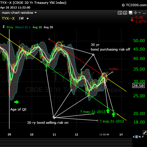
CONCLUSION: i have not begun to short the broader equity market. in the passed there have been a couple of ways i achieved that. (1) through purchasing inverse and inverse leveraged market index etfs OR through purchase of volatility etns. (2) if i don’t short the market but still want some protection, i’ll raise cash ahead of a perceived slow down by taking profits off the table and purchasing various bond related etfs whether treasuries or corp investible bond etfs. recently i’ve taken a higher position in bonds than normal for me in the following bond related etfs: $BOND $LQD $LTPZ $PDI $TLT. they comprise 20% of invested holdings vs 80% equities. and about 22% of my grand total account holdings is cash. let’s see what the future holds over the next 4 – 16 weeks.
RSI xUP setups stubby likes (no pos) $AEP $GIS $IFF $PNW $SAFM $SNI
Posted by stubbybrown in Technical Alerts on 2013/04/22
finviz charts http://bit.ly/17KSF8A
STOC xUP setups stubby likes (no pos) $BDX $BEAV $DPZ $ENR $FISV $IFF $LLY $PNW $RKT
Posted by stubbybrown in Technical Alerts on 2013/04/22
finviz charts http://bit.ly/12D0DB8
stubbystock technical alert 20WMA xDOWN bearish signal $FLS
Posted by stubbybrown in Technical Alerts on 2013/04/18
as you can see, flowserve $FLS has been on quite a run since lows in oct-2011 during the height of the european central bank charter formation and post S&P downgrade of u.s. sovereign debt. it’s never possible to tell how far markets can drop in the current sell-off. as a position trader, my downside limit for $FLS is the 50WMA. at the moment, selling is mild on light volume. if the $FLS does NOT bounce and begin forming a base, i will start peiling off 1/4 positions at a time. my thesis is the S&P500 is due for a 10% sell off from it’s recent highs. that’s another indicator i’ll be looking for as a basis to determine whether to sell positions. so far, i have sold no positions in $FLS.

stubbystock technical alert MACD xDOWN weekly signal $ENB $MANH $MWIV
Posted by stubbybrown in Technical Alerts on 2013/04/17


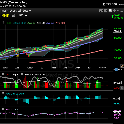
stubbystock technical alert 10WMA xDOWN signal $MMS $MSI $TDG
Posted by stubbybrown in Technical Alerts on 2013/04/17


stubbystock technical alert RSI xUP [EOD20130416] $AMGN $ASR $BRKB $CELG $CPA $DIS $GILD $HSY $SJM $TRIP $TWX $VIAB
Posted by stubbybrown in Technical Alerts on 2013/04/16
AMGN, ASR, BRKB, CELG, CPA, DIS, GILD, HSY, SJM, TRIP, TWX, VIAB – finviz charts & quotes http://bit.ly/13ilkkz
i am long these listed.

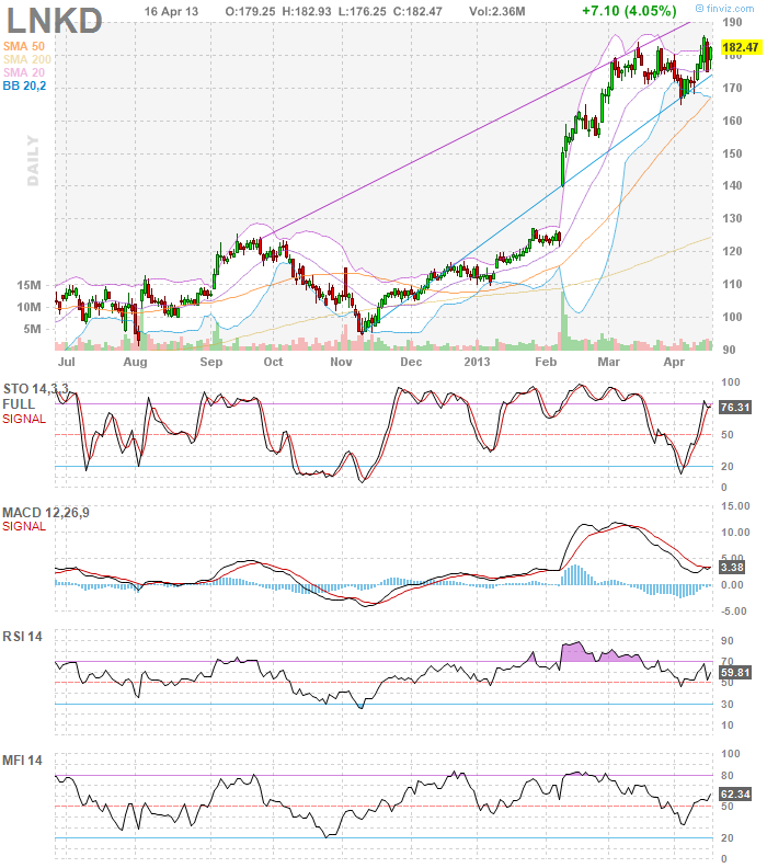
stubbystock technical alert 10DMA xUP 20DMA [EOD20130416] $LNKD $WAB
Posted by stubbybrown in Technical Alerts on 2013/04/16
-
You are currently browsing the archives for the Technical Alerts category.
Meet Stubby
my name is michael james. my aim is to articulate my wall street trading thesis and methodology as an individual trader. all trading i do is in my own SEP-IRA account. all content i post is for information & opinion purposes only and not intended to be investment advice.
STUBBY RSS FEED


ugly market conditions $SPX $DJIA $COMPQ $STUDY
Posted by stubbybrown in Commentary, Portfolio, Technical Alerts on 2013/05/31
today i unloaded a number positions as it’s possible the market is heading toward a correction (down 10% or more from recent high is technically what a correction amounts to). if i had done nothing, the portfolio only dropped by 0.78% while
this weekend i’ll provide a little detailed analysis and update my portfolio holdings.
COMPQ, DJIA, SPX
7 Comments